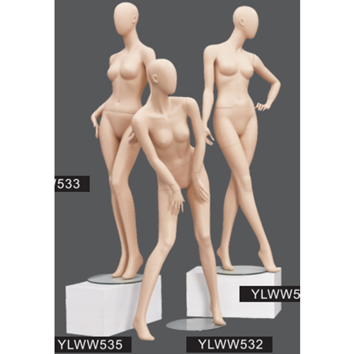
Compared with European and American clothing window props, domestic clothing window props are not so eye-catching. Why? Not self-deprecating. First of all, from the conception space to the details, the mannequins can't find any window that can compare with foreign ones. Compared with European and American shop windows, domestic shop windows are not so eye-catching. Why? Not self-deprecating. First of all, from the conception space to the details, I can't find any window that can compare with foreign ones.
messy space layout
window art
The essence of window design lies in the definition of space layout. Good space planning can highlight products without too many unimportant display elements, leaving large blanks, and can effectively convey the hierarchy of the window to the audience. And the messy window planning makes pedestrians tiresome, let alone shopping in the store.
Prop development has no idea
Ideas are what every planner seeks, and good ideas come from constant accumulation and communication. Especially in the manufacture of window props, as mentioned in the previous WeChat article, in the excellent foreign window design works of plastic models, window props are usually made of many discarded items. And also pay great attention to the combination of groups in the arrangement of furnishings.

ignore lights
Lights are the soul of planning. In a good book, if there is no excellent lighting to set off, the artistry of the window cannot be expressed. Especially in China, which is developing a "night economy", if the window lights at night can attract consumers, the consumption rate of entering the store will be very high.
Window planning lacks theme
In fact, whether at home or abroad, the replacement rate of window planning is very low, except for severe festivals, and then all year round. And foreign window planners are better at creating themed windows, using certain things, or inventing some themes that conform to the brand's characteristics out of thin air, and cleverly decorating the windows or giving them a new look. Such an approach not only insists on the continuous increase of customer flow in the store, but also solves the problem that the window is not conceived.
Not paying attention to details
Sean, the visual merchandising manager of Harvey Nichols in the UK, usually puts the details at the most important position when he reviews the window of Zhonghe Fashion. A leftover fishing line in the tote bag will affect the overall beauty of the window plan. For example, the second picture shows the window of a Shanghai street clothing store. Although it is unfair to use it like this, the ladder displayed in the window is not easy to explain.
Clothing deployment does not meet brand positioning
The window plan sells products, and the style of clothing needs to be perfectly matched with the theme of the window. The window display of the mannequin clothing is not a simple arrangement, but more of a brand positioning and a response to the theme.
Plagiarism is severe
This item is the most serious problem presented by the domestic window planning. Many domestic window designs that we think are very classic have actually been used many times in foreign countries. Comparing to the domestic window work I shot in a domestic exhibition before, according to Sean, a lecturer in Zhonghe Fashion Visual Marketing, "This window has been popular in European department stores for many years."